png.
A culture-driven lifestyle brand exploring the intersection of contemporary design, art, and youth culture through a flexible visual identity system.
00
problem
The challenge was to create a distinctive brand identity for png., a contemporary cultural and creative brand positioned between art, design, and lifestyle. The brand needed to appeal to a younger generation that values creativity, individuality, and visual culture while remaining flexible enough to expand across products, exhibitions, packaging, merchandise, and digital platforms.
solution
I developed a playful yet highly recognizable identity system centered around a custom wordmark, modular graphic language, and expressive color palette. The resulting visual system balances simplicity with personality, allowing the brand to maintain consistency across different applications while encouraging experimentation and cultural engagement.
png. was created as an exploration of how design can exist beyond traditional commercial branding. Positioned between art, culture, and lifestyle, the brand serves as a platform for visual experimentation and creative expression.
The name "png." references the digital image format, a symbol of contemporary visual culture and the way images circulate through modern life. This concept became the starting point for the identity system.
The target audience consists primarily of culturally engaged young adults who value creativity, self-expression, and contemporary aesthetics. Research revealed that this audience is drawn to brands that feel authentic, playful, and visually distinctive while remaining easy to share across digital platforms.
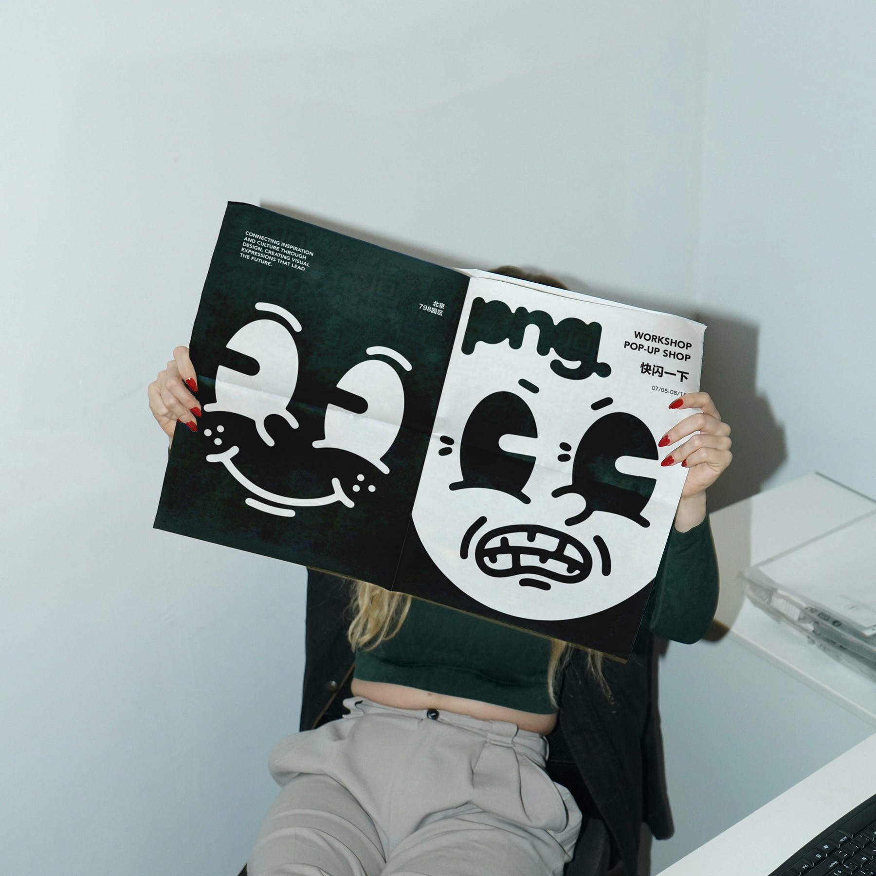
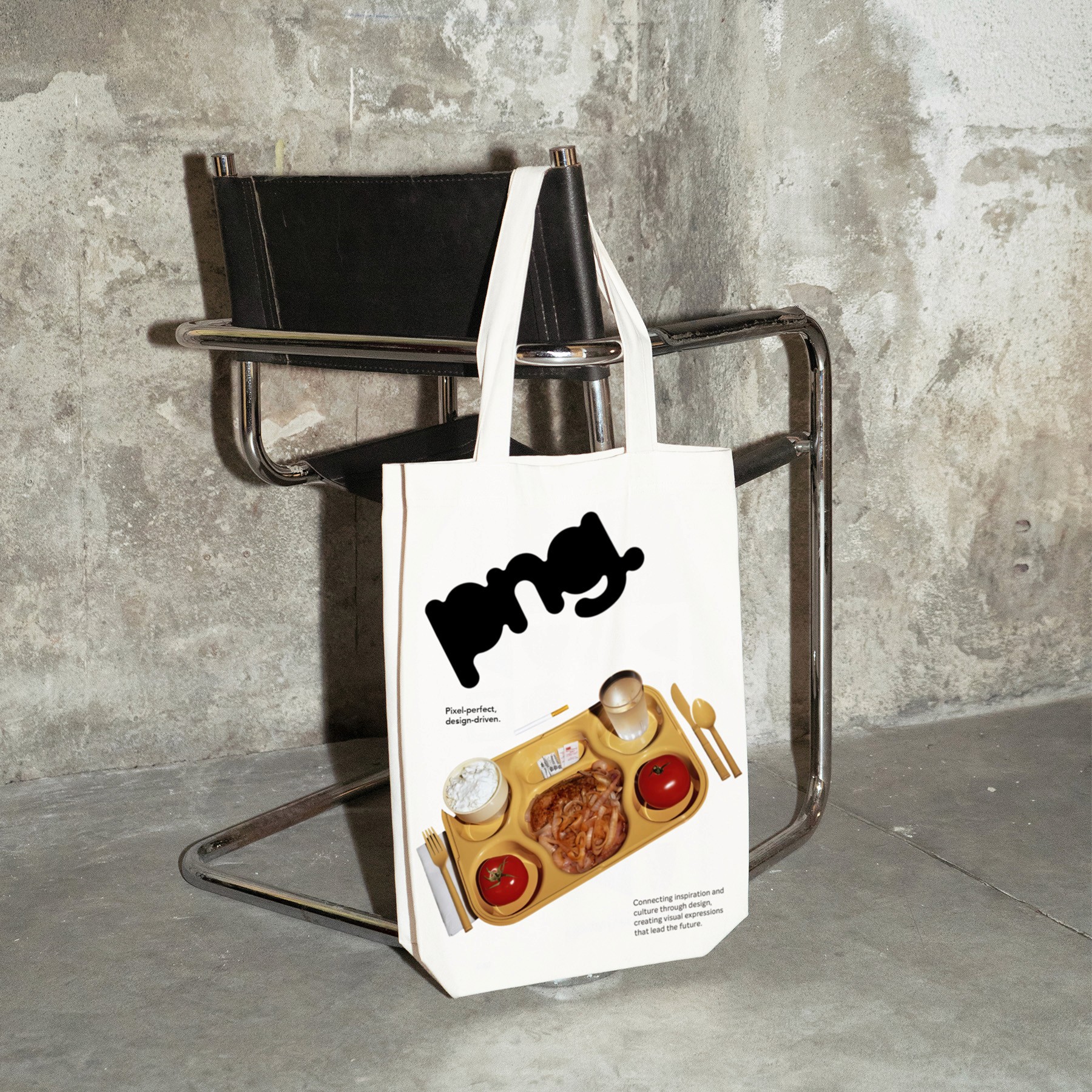
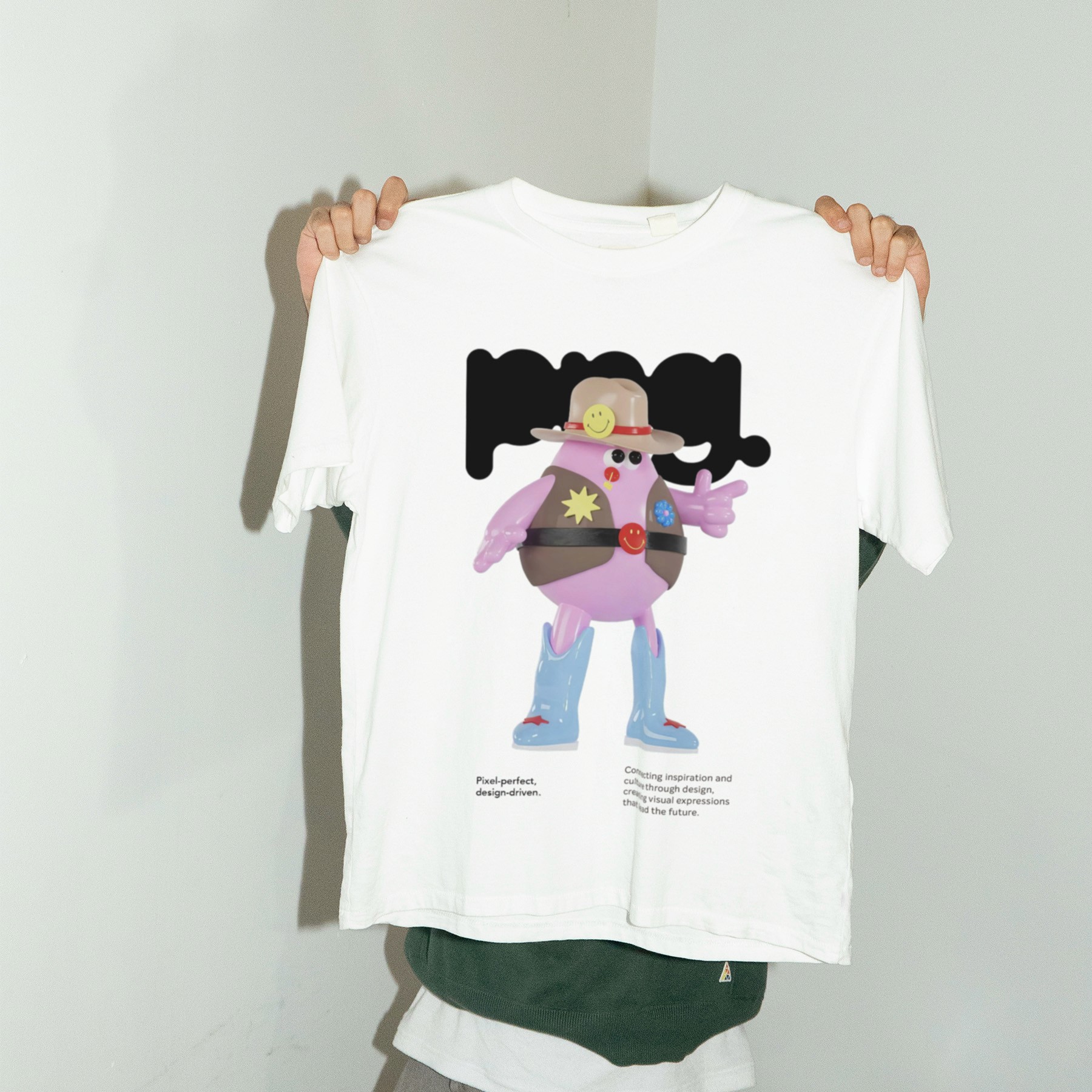
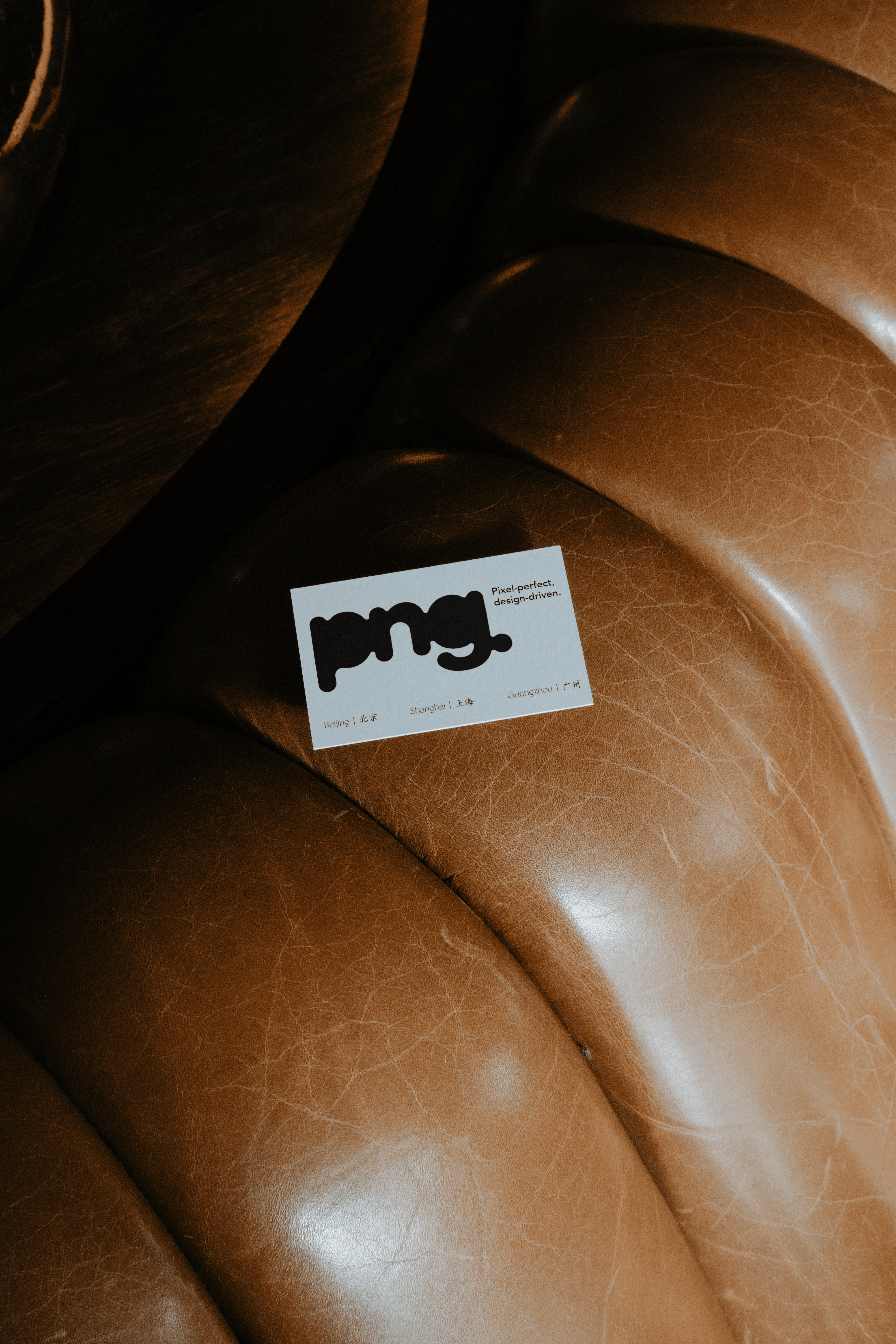
To reflect these characteristics, I designed a custom logotype featuring soft, fluid letterforms. The rounded shapes create an approachable personality while communicating flexibility and movement. The period at the end of the logo functions as a visual anchor, reinforcing a sense of confidence and completion.
Beyond the logo itself, the project focused on creating a scalable visual system. A combination of bold typography, organic graphic elements, geometric compositions, and an adaptable color palette allows the identity to perform consistently across different formats and environments.
The color system was developed to balance warmth and energy. Earthy neutrals establish a sense of sophistication, while vibrant accent colors introduce contrast and playfulness. This combination reflects the brand's position between contemporary culture and everyday lifestyle.
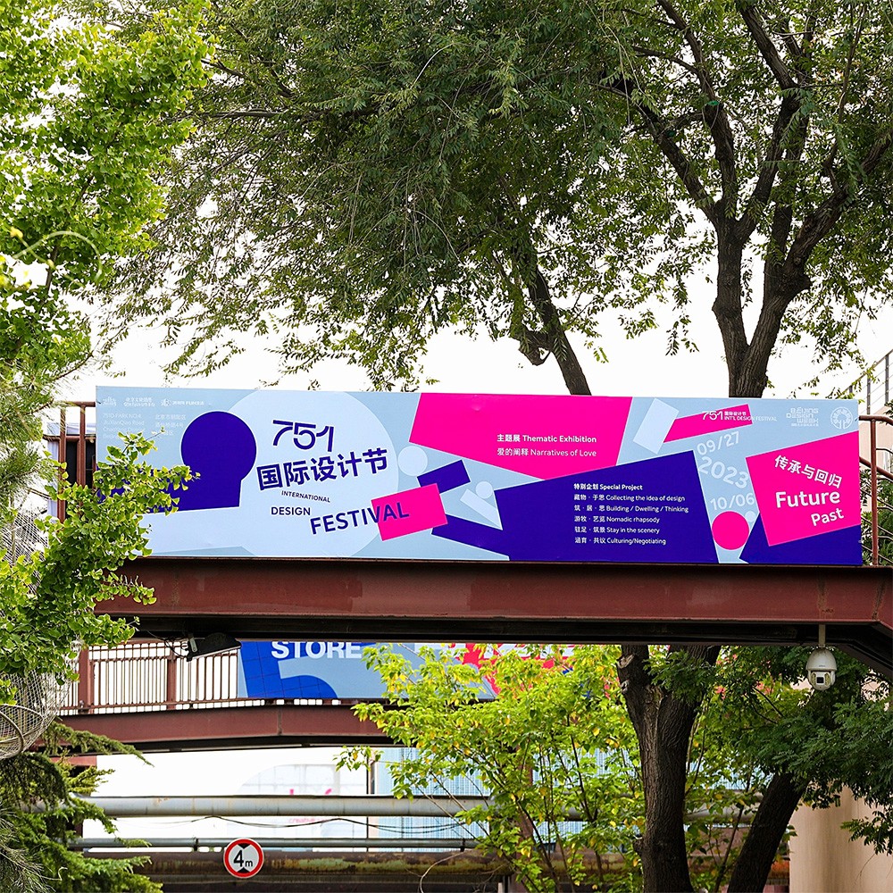
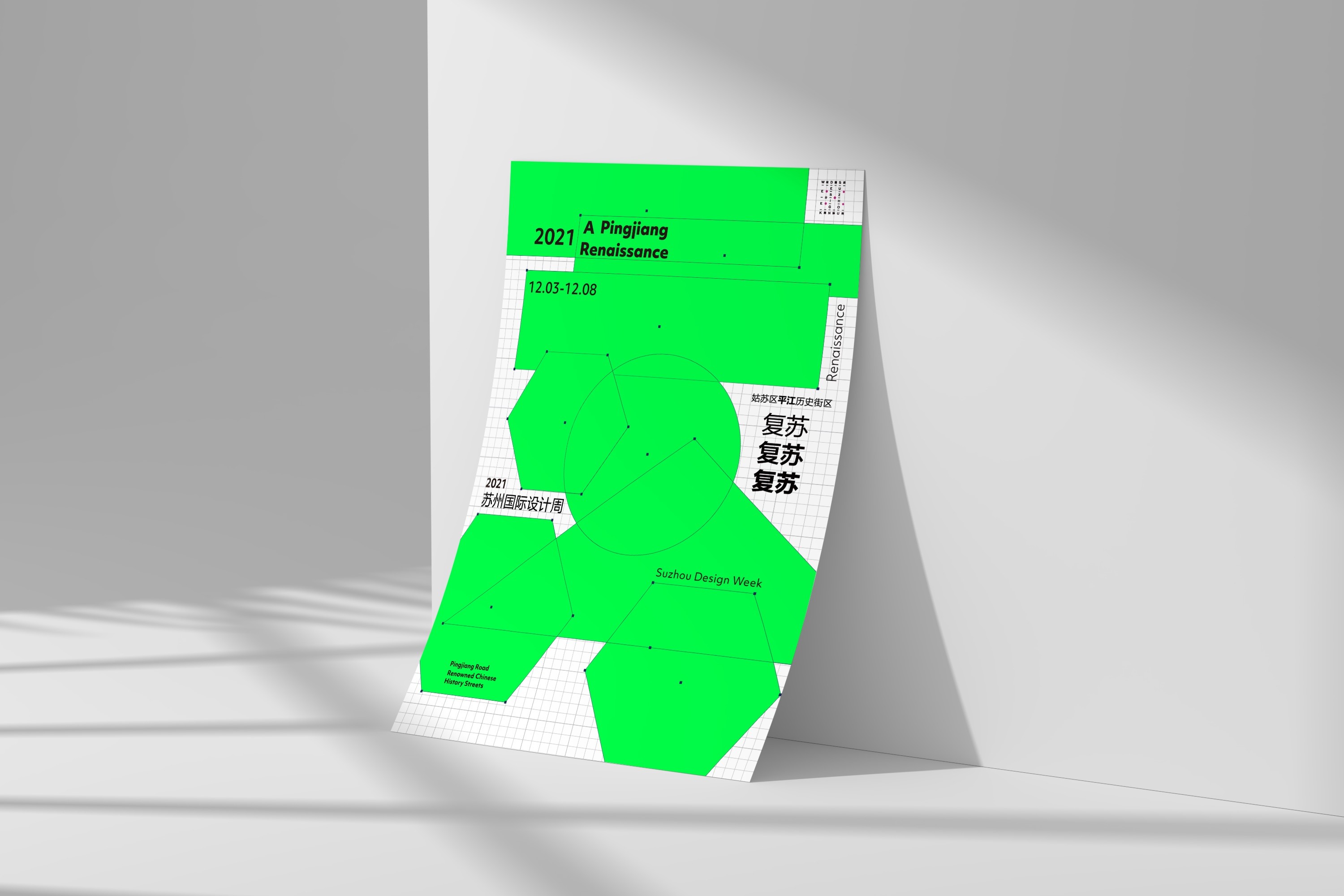
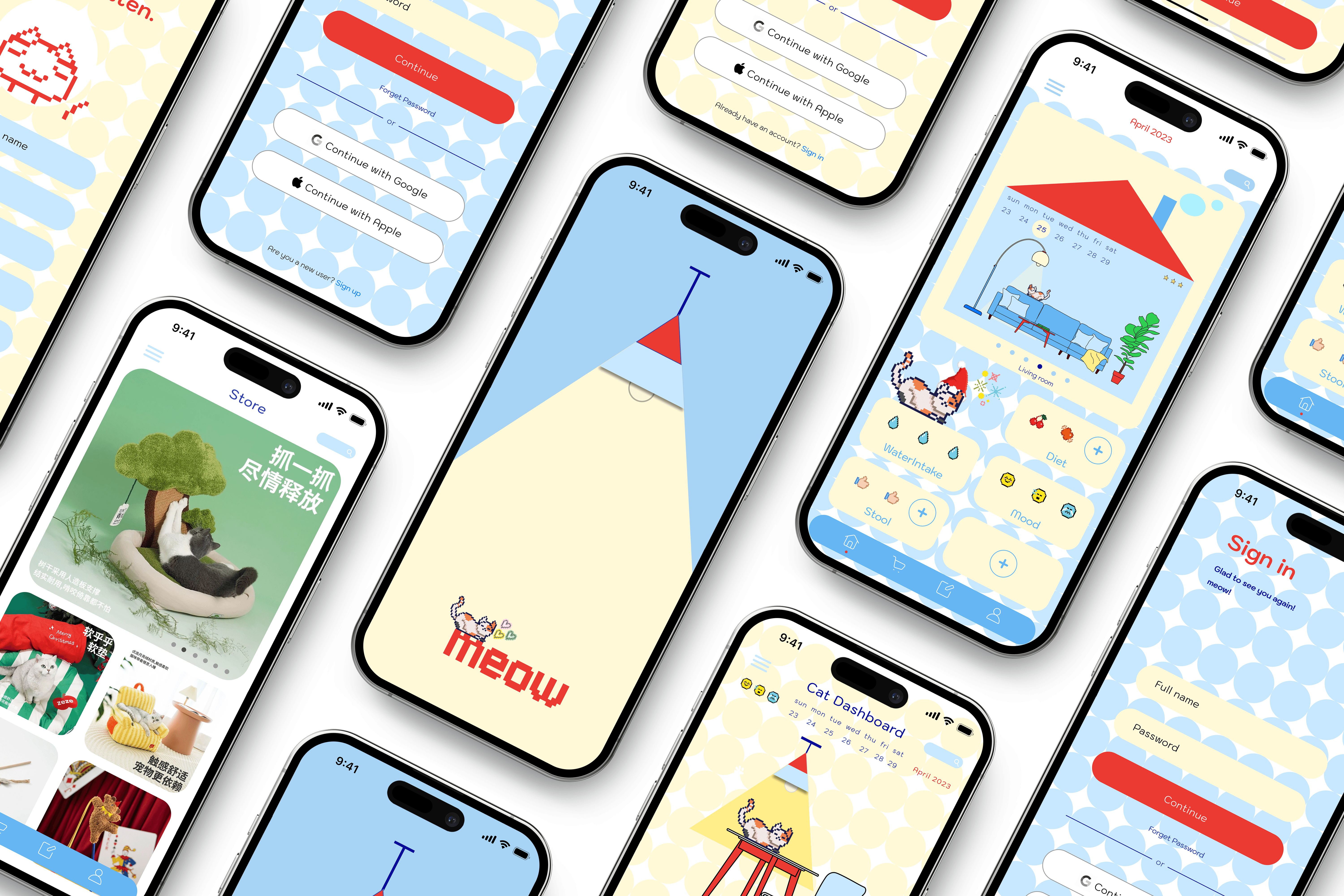
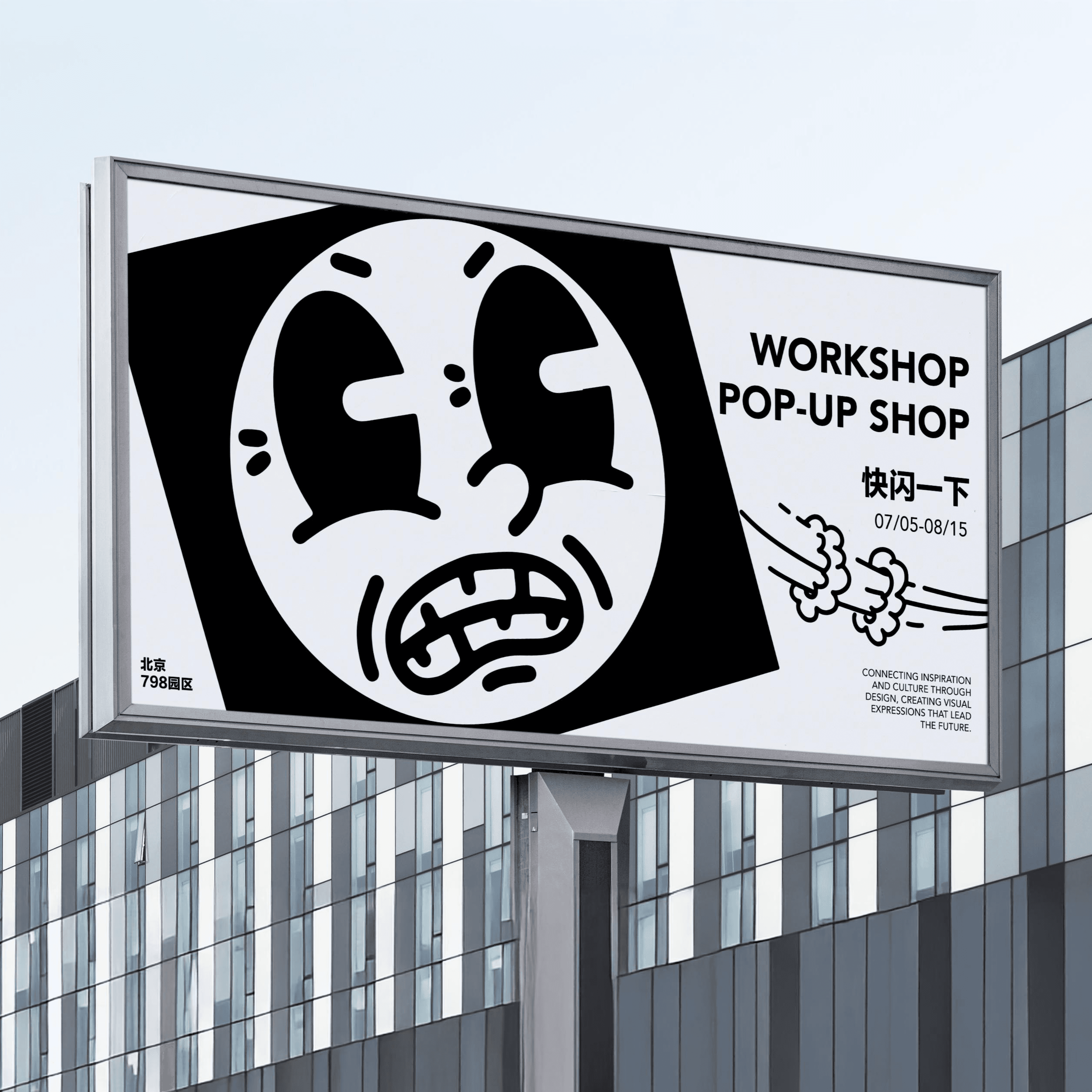
The identity was applied across a range of touchpoints including packaging, merchandise, editorial materials, promotional graphics, environmental applications, and exhibition experiences. Each application reinforces the brand's creative personality while demonstrating the flexibility of the system.
Rather than functioning as a static logo project, png. was designed as an evolving visual framework capable of supporting future collaborations, products, and cultural initiatives.
Impact
The project established a complete visual identity system that successfully translated the brand's values into a cohesive and recognizable visual language.
Through its flexible structure and strong visual character, the identity demonstrates my ability to develop branding systems that extend beyond logos and function effectively across physical, digital, and experiential environments.
year
2026
timeframe
4 Months
tools
Adobe Illustrator / Adobe Photoshop / Adobe InDesign / Figma
category
Branding and Identity
01
02