2021 Suzhou Design Week
Key visual and visual identity system for 2021 Suzhou Design Week, translating Suzhou’s traditional architecture, canals, and cultural rhythm into a contemporary festival communication system.
00
problem
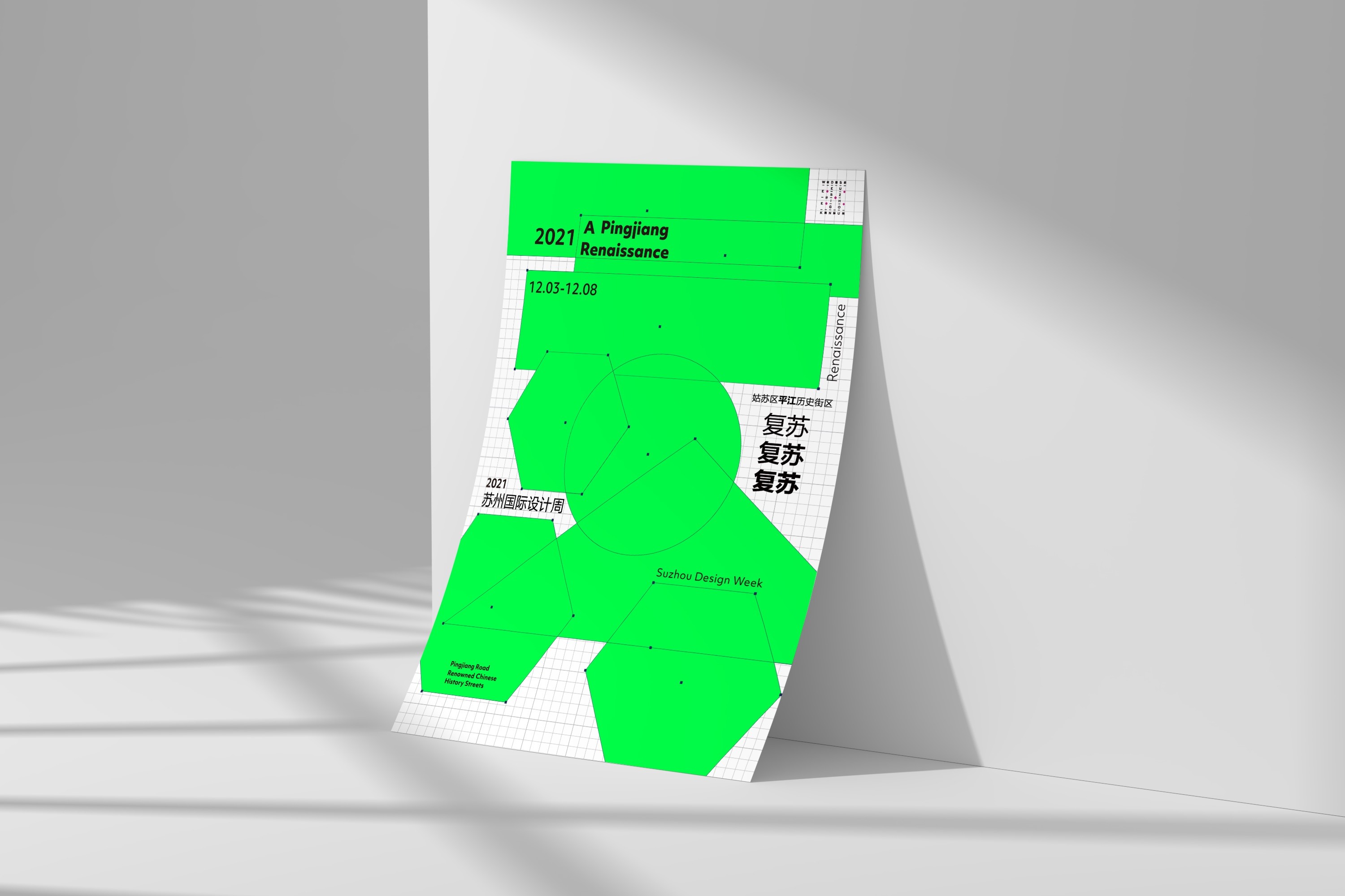
Suzhou Design Week 2021 centered on the theme of “A Pingjiang Renaissance,” aiming to present Suzhou’s traditional culture through a fresh and contemporary design language. The challenge was to create a visual identity that could represent the city’s cultural heritage without relying on decorative clichés. The system needed to feel modern, energetic, and adaptable across posters, maps, street banners, signage, and exhibition spaces.
solution
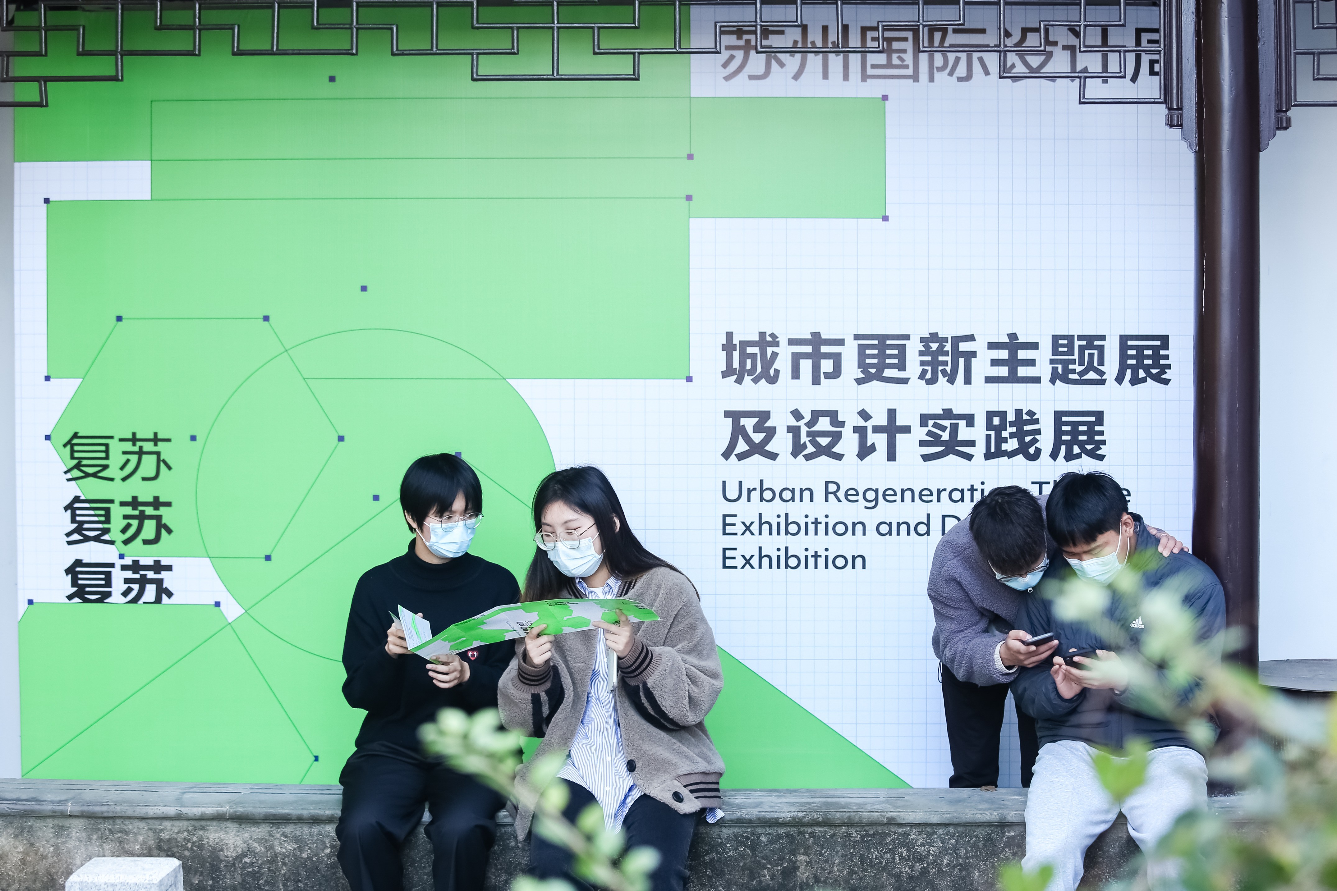
I developed a key visual system based on the concept of revitalization. By abstracting Suzhou’s iconic window patterns, canal bridges, and architectural structures, I created a dynamic graphic form that resembles the Chinese character “苏” while also suggesting movement and renewal. A striking fluorescent green was used as the primary color to express vitality, growth, and cultural rebirth. Combined with structured grids, delicate linework, and modular graphic elements, the final system created a bold yet culturally grounded identity for the festival.
Suzhou is a city defined by layers: classical gardens, water lanes, stone bridges, traditional windows, and a quiet rhythm that has shaped its cultural identity for centuries.
For 2021 Suzhou Design Week, the design challenge was not simply to reference these elements visually, but to reinterpret them through a contemporary lens. The goal was to build a festival identity that could bring the city’s heritage into the present while expressing a sense of renewal.
As the key visual designer, I began by studying the visual structure of Suzhou’s architecture, especially the relationship between windows, bridges, canals, and spatial rhythm. These forms became the foundation for a graphic system that combines cultural symbolism with modern abstraction.
The central visual was developed around the idea of revitalization. Abstract shapes inspired by Suzhou’s traditional window patterns and river bridges were reorganized into a dynamic composition, forming a contemporary interpretation of the character “苏.” The form also suggests a running figure, symbolizing the city moving forward through design, culture, and creativity.
Color played an important role in shifting the project away from a nostalgic visual tone. Instead of using muted historical colors, I chose a vivid fluorescent green as the primary identity color. This green became a symbol of energy, growth, and renewal, allowing the festival to stand out strongly within the urban environment.
The visual system was applied across multiple festival touchpoints, including posters, event maps, directional signage, street flags, exhibition graphics, and public installations around Pingjiang Road. Each application maintained the same visual language while adapting to different formats, scales, and viewing distances.
One of the main challenges was balancing cultural recognition with contemporary expression. The final system avoided literal illustration and instead used abstraction, proportion, and rhythm to communicate Suzhou’s identity in a more open and flexible way.
Through this project, the visual identity transformed traditional city symbols into a living design system. It created a consistent festival experience that connected Suzhou’s historical memory with a renewed cultural energy.
Impact
The final key visual became the primary communication system for 2021 Suzhou Design Week and was applied throughout the festival environment, including street banners, maps, signage, exhibition graphics, and promotional materials.
The project demonstrates my ability to translate regional culture into a contemporary visual system, building an identity that works across both printed communication and large-scale public spaces.
year
2021
timeframe
2 Months
tools
Adobe Illustrator / Adobe Photoshop / Adobe InDesign / Figma
category
Branding and Identity
01

02

03